This is a text box and not a caption, but bear with me.
So for my final project, I made a compilation of Frozen in other movies, games, and shows.
The things I used were:
50% Off
Eragon
Lord of the Rings
Wall-E
Gravity
The Breakfast Club
Five Nights at Freddy's
Batman
Hunger Games
the last picture is me with Elsa's hand. I never noticed how wierd it looked until I did this project.
So this is the last project I have this semester. I will probably take off winter break, but I will see what I can do about the future, since I won't have this class next semester.
Happy Christmas, Hanukkah, Kwanza, or whatever you celebrate!
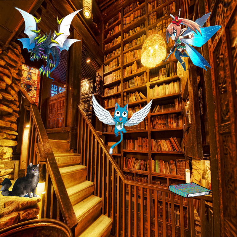
So our project for this week was Landscapes, more specifically making one and putting stuff in it, essentially creating our own utopia. I did mine in a library. The things I put in it are Fairy Bahamut and from Brave Frontier, Happy from Fairy Tail, a cat, and Colonel Sassacre's Daunting Text of Magical Frivolity and Practical Jalapity.
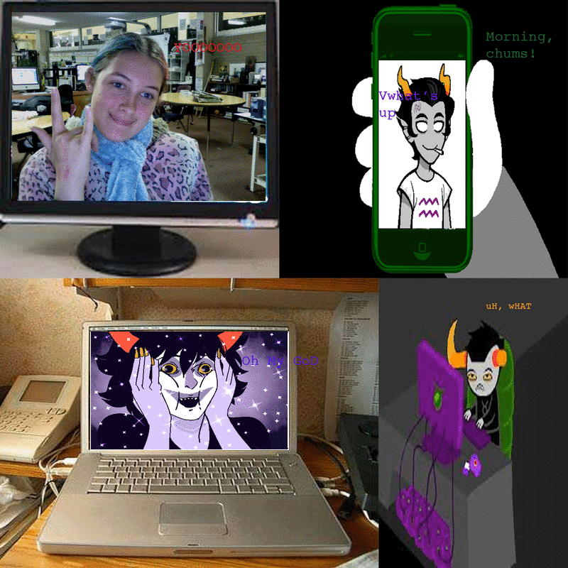
So we had to make Photoshopped pictures of celebrities (or fictional characters) as our friends, so I did a Skype-computers thing. There's me, Cronus Ampora, Jake English, Gamzee Makara, and Tavros Nitram, all on electronic devices. Fun!
Happy Veterans Day!
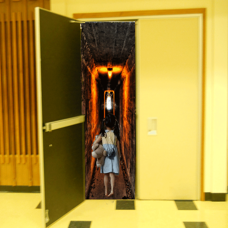
Ok, so I don't have to answer the IB questions about it, but I'll do a little bit of explaining. We did Photoshop surrealism, and my idea was to do an open auditorium door. I started out with a pretty, Mario-like land, but I couldn't find a picture that worked with the small space. So I went with a spooky corridor, and then I found out I had to have 3 pictures. I added in the little girl. I guess what this picture is trying to say is that high school is a scary place, and you enter it feeling like a little kid, but there's light at the end of the tunnel.
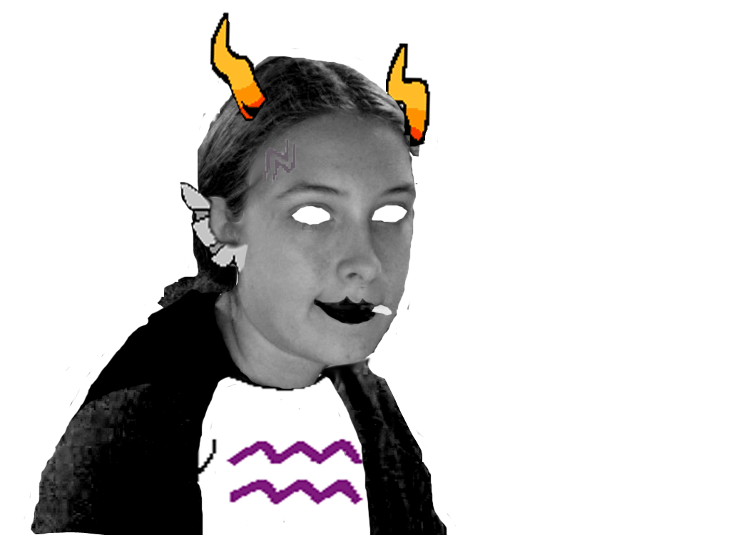
IB Artwork Rubric Composition
1. I used colour and contrast.
2. My project is a part of personal worth because I made myself look like Cronus Ampora (a character from Homestuck).
3. I used a new technique by using the colour editing part of Photoshop. I used a few techniques from Adobe Illustrator, like making things fit and be the right size.
4. I used a computer to do my project because Photoshop is on a computer.
5. I preserved my work by posting it here. ===
Concept:
1. Using Photoshop
2. Eraser Tool
3. The amount of work it took to get all the extra body parts in place is not apparent in this picture. It took forever to get those naughty horns to go where I wanted them to. ==
Completeness:
1. I changed my artwork to a Cronus-themed piece because I wanted to cosplay as that character (and I will)
2. The dominant principle I used in this artwork was Contrast. I wanted to make sure that the different little tidbits popped out while also blending in.
3. I achieved an emotional connection to my artwork by associating it with Homestuck. ==
Creativity:
1. I was committed to this project because it was something I wanted to learn.
2. I showed curiosity and self-motivation by trying to make myself look like Cronus Ampora.
3. The risk involved in this project was making it look good. I wasn't sure how well the horns would turn out, but they look fine.
4. The internet taught me how to change the colour of certain objects on the page. I used those skills to change the skin, jacket, hair, eye, and lip colours. ==
Craftsmanship:
1. I developed my idea by starting with a picture from the internet and going from there.
2. I knew I wanted to look like Cronus, so I used pictures from the internet as models.
3. I had to figure out how to make the different body parts work with each other. It got complicated with the horns, because I had to Lasso two shapes instead of one.
5. I used Photoshop to make my artwork.
==
[To see a picture of Cronus Ampora, go to my blog.]
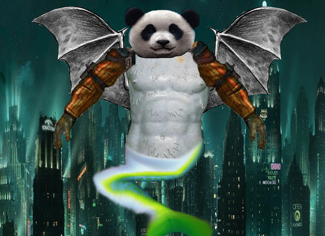
IB Artwork Rubric Composition
1. I used colour and shape.
2. My project is a part of personal worth because the background is Rapture (from the Bioshock Series).
3. I used a new technique by using pretty much all of Photoshop. I used a few techniques from Adobe Illustrator, like making things fit and be the right size.
4. I used a computer to do my project because Photoshop is on a computer.
5. I preserved my work by posting it here.
Concept
1. Using Photoshop
2. Eraser Tool
3. The amount of time it took to pick the photos is not apparent in this photograph. I had to use 5 body parts to make the animal, and it was tough to find parts that would not only work in the underwater environment of Rapture, but would look good together. (You have no clue how long I spent trying to find arms.)
Completeness
1. I changed my artwork to a Bioshock-themed piece because I wanted to do something from that environment.
2. The dominant principle I used in this artwork was Contrast. I wanted to make sure that the different body parts popped out while also blending in.
3. I achieved an emotional connection to my artwork by associating it with Bioshock and pandas.
Creativity
1. I was committed to this project because it was something I wanted to learn.
2. I showed curiosity and self-motivation by trying to create a unique animal with unique animal parts.
3. The risk involved in this project was making it look good. I wasn't sure how well the panda head would turn out, but it looks fine.
4. A friend in class taught me how to blur the tail. At first it was a huge stretched tail, but my friend helped me make it look better.
Craftsmanship
1. I developed my idea by starting with a picture from the internet and going from there.
2. I knew I wanted to do a mermaid/man, so I started thinking about animals that could survive underwater.
3. I had to figure out how to make the different body parts work with each other. It got complicated with the arms, because I had to Lasso two shapes instead of one.
5. I used Photoshop to make my artwork.
[This is my Photoshop animal! I used pterodactyl wings, a centaur's body, a mermaid/fish tail, a panda head, and the arms from the Big Daddy from Bioshock. I'm not sure what to call it though. A Big Centdactylman? lol]
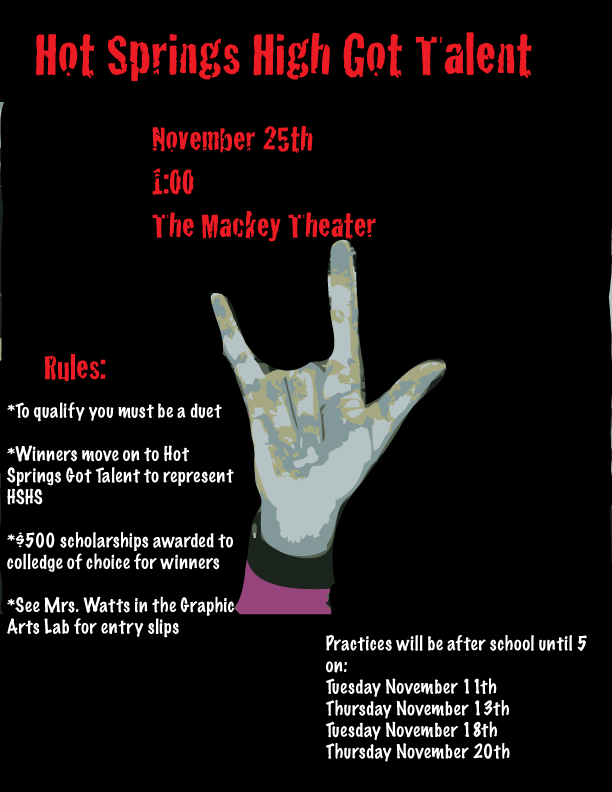
This is the poster for my high school's talent show. I might be in it, but the "you must be a duet" thing is what's stopping me. Anyway, here it is!
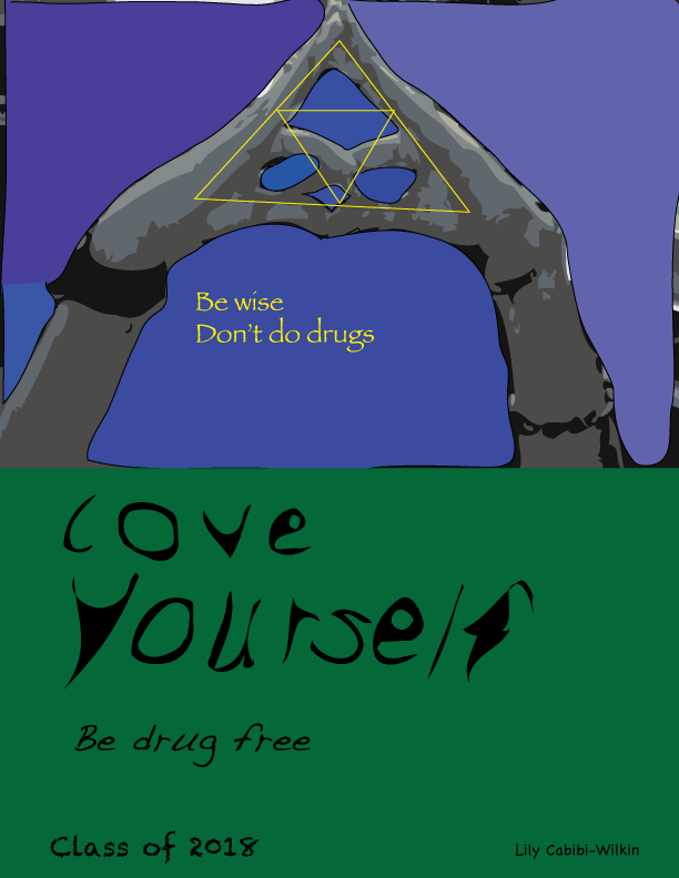
This is the poster I made for my school's Red Ribbon week. I'm not supposed to say anything about it but I figured it would be better to add a bit of context.
I even warped the letters this time!
In case anyone is wondering, that is the Triforce of Wisdom from the Legend of Zelda series.
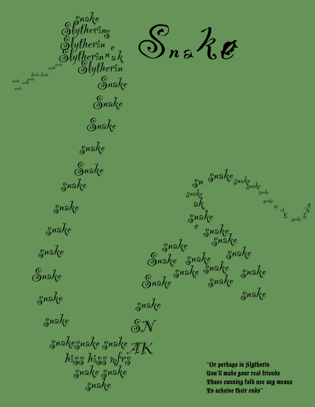
IB Artwork Rubric Composition
1. I used rhythm, pattern, colour, and shape.
2. My project is a part of personal worth because it is themed around my Hogwarts house.
3. I used a new technique by using pretty much all of Adobe Illustrator. I used a few techniques from MS Paint, like tracing and filling in things.
4. I used a computer to do my project because Adobe Illustrator is on a computer.
5. I preserved my work by posting it here.
Concept
1. Using Adobe Illustrator
2. Text Tool
3. The amount of time it took to figure out how to warp the letters is not apparent in this photograph. It took awhile to figure it out, and by then I had finished the snake.
Completeness
1. I changed my artwork to a Slytherin-themed piece because I wanted to do something fandom-themed.
2. The dominant principle I used in this artwork was rhythm. The flow of the snake has a sort of rhythm.
3. I achieved an emotional connection to my artwork by associating it with my Hogwarts house (Slytherin)
Creativity
1. I was committed to this project because it was something I wanted to learn.
2. I showed curiosity and self-motivation by trying to do what my teacher said would be the hardest animal to do.
3. The risk involved in this project was making it look good. My teacher said that the snake would be the hardest one to do, so had to work extra hard to prove her wrong.
4. A friend in class taught me how to warp the letters. I may not have warped them as much as my teacher would have liked, but I still warped letters.
Craftsmanship
1. I developed my idea by starting with a picture from the internet and going from there.
2. I knew I wanted to do a snake, so I kept looking until I found one that worked for me.
3. I had to figure out how to make the letters shape into a snake. It got complicated around the tongue and tail, where I had to shrink the letters to keep the shape.
5. I used Adobe Illustrator to make my artwork.
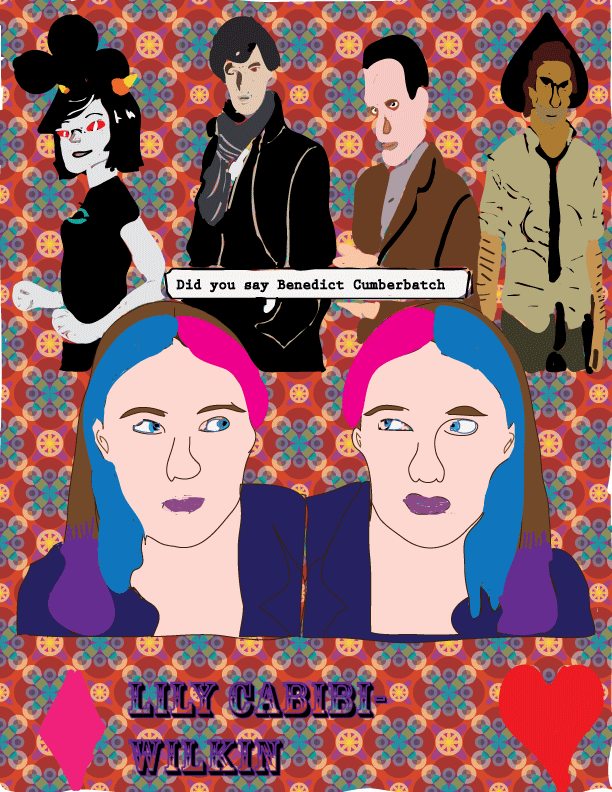
IB Artwork Rubric
Composition
1. I used contrast, pattern, colour, texture, and shape.
2. My project is a part of personal worth because it has part of an image that I made.
3. I used a new technique by using pretty much all of Adobe Illustrator. I used a few techniques from MS Paint, like tracing and filling in things.
4. I used a computer to do my project because Adobe Illustrator is on a computer.
5. I preserved my work by putting it on my flashdrive, printing it, and posting it here.
Concept
1. Using Adobe Illustrator
2. Live Paint Bucket
3. The amount of decision that went into choosing the images is not apparent in the artwork. I went through a lot of other background photos before settling on the design.
Completeness
1. I changed my artwork to all drawings because my teacher said I shouldn't have plain images on it. Originally the top image (Londerland Detectives) was a jpg, but I drew over it.
2. The dominant principle I used in this artwork was contrast. From my hair to the background pattern, I tried to have as much contrast as possible
3. I achieved an emotional connection to my artwork by adding on a drawing I had already made.
Creativity
1. I was committed to this project because it was un.
2. I showed curiosity and self-motivation by trying to use as many of the tools as possible.
3. The risk involved in this project was my ignorance towards Adobe Illustrator. I normally use MS Paint.
4. My teacher helped me reconsider just using a collage of images by telling me I would have to draw all of them.
Craftsmanship
1. I developed my idea by starting with a picture of myself and going from there.
2. I didn't really preplan much. I just kind of let inspiration take me.
3. I encountered several problems with the paint bucket tool. I eventually settled for using the paintbrush, which was another task on its own.
5. I used Photo Booth and Adobe Illustrator to make my artwork, as well as pictures from my flashdrive.
Personal Notes
As you can see, I used Londerland Detectives in my image. I had a lot of fun drawing all the people, but I hope Monk isn't too creepy. Eyes were never my strong suit. The easiest one to trace was Terezi. I guess tracing artwork is easier than tracing pictures!
